

Tag: Block Editor Patterns

Twenty Twelve WordPress theme
The 2012 theme for WordPress is a fully responsive theme that looks great on any device. Features include a front page template with its own widgets, an optional display font, styling for post formats on both index and single views, and an optional no-sidebar page template. Make it yours with a custom menu, header image,…

Twenty Eleven WordPress theme
The 2011 theme for WordPress is sophisticated, lightweight, and adaptable. Make it yours with a custom menu, header image, and background — then go further with available theme options for light or dark color scheme, custom link colors, and three layout choices. Twenty Eleven comes equipped with a Showcase page template that transforms your front…

Twenty Fourteen WordPress theme
In 2014, our default theme lets you create a responsive magazine website with a sleek, modern design. Feature your favorite homepage content in either a grid or a slider. Use the three widget areas to customize your website, and change your content's layout with a full-width page template and a contributor page to show off…
Seedlet WordPress theme
Seedlet is a free WordPress theme. A two-column layout and classically elegant typography creates a refined site that gives your works and images space to breathe – and shine. Seedlet was built to be the perfect partner to the block editor, and supports all the latest blocks. Writing, audio, illustrations, photography, video – use Seedlet…

ExS WordPress theme
ExS theme is a fastest and smallest multipurpose Gutenberg compatible highly customizable theme without 3rd party dependencies. It is designed to have 100% Google Page and LightHouse speed. It has an extra small size of CSS (70kB) and JS (3kB) assets, 100% SEO optimised and valid code and it is 100% mobile friendly. It also…
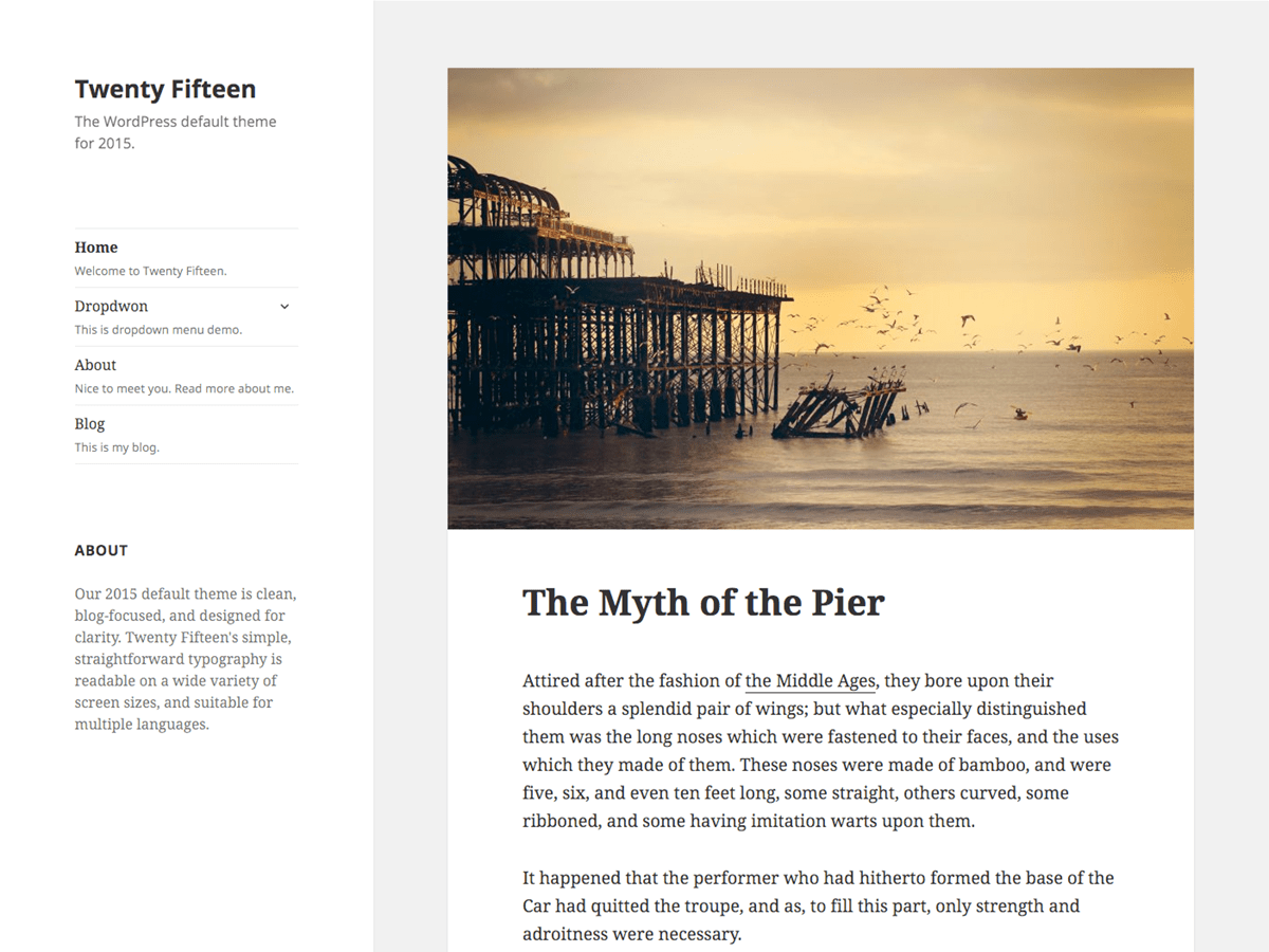
Twenty Fifteen WordPress theme
Our 2015 default theme is clean, blog-focused, and designed for clarity. Twenty Fifteen's simple, straightforward typography is readable on a wide variety of screen sizes, and suitable for multiple languages. We designed it using a mobile-first approach, meaning your content takes center-stage, regardless of whether your visitors arrive by smartphone, tablet, laptop, or desktop computer.…